As I type, Warner Bros. is hosting a film panel in Hall H at San Diego Comic-Con, and they kicked off the show with Zack Snyder and the stars, a snippet of footage from Batman v Superman: Dawn of Justice, and, most relevant to my interests, a shot of Gal Gadot as Wonder Woman. Let’s take a look:
First off, this is definitely Wonder Woman, which is really good. She’s got a tiara, bracelets, a lasso, boots, all of the stuff we expect Wonder Woman to have. They haven’t screwed with the costume in any big ways, and any of the changes are about what you’d expect when a comic book costume is adapted for the big screen. They’ve stayed very faithful to the character, and I’m really glad about that.
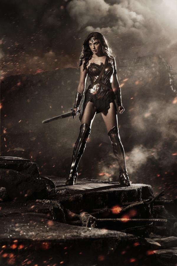
They just put out a high resolution image, so let’s go through this with a fine tooth comb, starting at the top:

I’ve got to be honest: I hate the tiara here. It’s needlessly complicated, and doesn’t look like Wonder Woman’s tiara should look. It’s a simple design that’s been roughly the same for 75 years. It comes to a point at the top, has no fancy adornments or lines or what have you, and there’s a red star in the middle. It’s rather iconic. This is not that, which I find a little bit disappointing. The tiara should scream “WONDER WOMAN!!” and this does not.
You’ll note there’s no choker, which is a change I do like. The choker’s she’s had since the New 52 began never really worked for me.
Let’s move down to the torso:

The bodice is very much New 52 Wonder Woman, with a couple of tweaks I like. There’s also a belt/strap thing that I assume leads to a sheath for her sword or some such. It looks like they’ve gone with gold for the breast plate instead of silver, so hooray for the classic colouring, and they’ve opted for a smaller belt instead of a big plate sort of thing which looks good. They’re definitely going for an ancient armour vibe, and pulling it off nicely here. I think everything going on in the torso turned out really well.
To the skirt:

It’s really, really short. They could have done briefs and we’d see just as much skin. But so it goes with Wonder Woman; you’re gonna get a lot of leg. And I like what they’ve done here. It looks functional and matches the bodice well, keeping that ancient armour aesthetic going, and while this picture has a general red/brown hue to it, it looks like the skirt is blue. There are no stars, but I really didn’t think there would be. It’s a tricky thing to have not look silly, especially given the ancient vibe they’re going for. Could be a little longer, but I like this too.
Now onto some classic Wonder Woman elements:

The bracelets look really nice! I like the detailing, and the leather around the wrist. Straight, flat bracelets would probably be rather boring on screen, and these look cool, functional, and fit the rest of the outfit well. And there’s a lasso! I’m so glad there’s a lasso. It looks like a lasso should, and is on her hip where it should be. That’s very fun.
The sword is cool too. It’s looks a little stubby, but that may just be the angle she’s holding it. The metal’s a bit dull, but so is all of the metal in this picture. So it goes with a Zack Snyder movie, really.
Now the boots:

It looks like they’ve gone for bracers more so than actual boots. The line down the middle is reminiscent of the white stripes that go down Wonder Woman’s boots, and I would have liked to see the white here, or something similar for a contrast, but these look cool. They match the rest of the costume, and look pretty bad ass.
My only real issue here is the heels. They’re not stiletto-esque, I suppose, which is something, but even as a sort of wedge heel it’s entirely impractical and unnecessary. After spending all this time constructing a cool, functional warrior outfit, the heels kind of undercut the effect. It’s really hard to fight in heels. It’s just not practical. The gal’s gonna twist her ankle.
But overall, I like it. The only thing I’m really irked about is the tiara, because I love the classic tiara and see it as such an iconic element of the character. I’m not wild about the colouring as well, but given how dull and grey Man of Steel was I’d have been an idiot to expect bright colours. This is just one picture, obviously, but the colours all sort of muddle into a brownish tone, and I hope that in the movie we’ll get more of a contrast between the red of the bodice, the blue of the skirt, the gold of the chest piece and belt, and what I assume is the silver of the bracelets (from this image, it’s hard to tell their exact colour). I think that Wonder Woman should be a bright character, but if you’re going to make Superman all dark and grayish then a less vibrant Wonder Woman continues that style.
I’m still super concerned about the movie as a whole. Man of Steel looked cool before it came out too, and then it was god awful. I also have serious reservations about Zack Snyder and David Goyer and how they approach female characters. But on the plus side, my bar for Batman v Superman is set so low that I now find myself pleasantly surprised when things turn out well. And I think that, all together, Wonder Woman’s costume turned out well. The outfit is good, and Gal Gadot looks pretty fierce and bad ass. I can’t wait to see her in action! The proof is in the pudding, and we’ve got a bit of a wait for that, but yeah, this picture makes me fairly happy.

The heel on the boots was the one thing I was hoping against as it’s always been an element added to the character I’ve never liked
And here they are anyway.
I think I see why people enjoy arrow so much now because while I believe better writing and use of characters could make it a great show they’re just happy to see super-heroes on tv because no matter what happens with BvS:DOJ I think I’m going to love it regardless
The heels are such a silly choice. There’s just no reason for them; no sensible superheroine is going to run around in heels. It’s a small thing, but I think it says a lot about their approach to the character that no one said, “Hey, heels are a dumb choice.”
Here’s my big problem with it.. It’s Xena. The coloring, the armor, the sword, her lasso in the same place as Xena’s Chakram, the skirt.. it’s all Xena. This entire outfit SCREAMS Xena Warrior Princess.. not Wonder Woman. That is a huge problem to me. But given that DC hasn’t gotten WW in decades, I didn’t expect anything different.
The lasso has always been on the right
And she is a warrior princess
I hate that she has a sword she is here in man’s world on a mission of peace and I think visually a lasso could be an awesome weapon with it being unbreakable and able to stretch as long as she wants it too.
But Xena is a better inspiration then what the Kelley Wonder Woman tv show had
I suppose there are worse things to mimic than Xena. I’d watch a Batman/Xena team-up. But yeah, with this colour scheme it’s definitely got a Xena vibe. It would’ve been nice to see them make her more distinctly Wonder Woman.
Xena’s chakram was included specifically to mimic the look of Wonder Woman’s lasso hanging off her hip. Xena looks like Wonder Woman, not the other way around.
It’s a filter on the pic go on my Pinterest Bryce babin and see the really colors
I’m not buying Gal Gadot as Wonder Woman, not at all. To me this looks like a figure skater. I pick up the sexiness before the strength. This is as hot woman who is also kind of strong as opposed to a strong woman who is beautiful. The wedges are preposterous and this choice tells me they have no idea what Wonder Woman’s all about. The skirt is pointless, the sword is very short and also pointless. They missed the brief.
For one, Wonder Woman in the comics will never look like a real life person so please shut up. All of you make me sick. She doesn’t need to bulk up, you need to simmer down. Your expectations for this woman are outrageous.
Also, she gets her strength mostly from her costume. -.-
THIRDLY, I love this costume way more than the comic’s, and I LOVE Wonder Woman. I just think they tried Americanizing Wonder Woman too much and she’s from a totally different land! Red white and blue is too much! The change was well needed. She does not have to resemble a crime fighting flag.
Lastly, I love Gal and think she is THE perfect choice for this part. There is a reason DC gave such an iconic role to HER! Pipe it down and sit the hell down please and thank you. If you don’t like it, fine, don’t waste your money on going to see it. I personally think this will be WORTH IT ALL!
Would it really have hurt for Zack Snyder to have put a little color into Wonder Woman’s costume? Everything he does is so dark and muted and drab. It’s like he is embarassed to be making a movie featuring characters wearing costumes.
I cannot believe that DC still has not learned from all of Marvel Comics’ successful films that you can do a realistic live action superhero movie with characters who still look colorful & dynamic like their original published counterparts.
Snyder doesn’t seem to care for colour. Muted tones are more his jam. It works in certain situations, I suppose, but not at all for superheroes. Marvel totally strikes the right tone, literally and figuratively, I find.
Sabine should be Her Sister:
http://sabinemondestin.com/sabinepost/i-want-to-be-the-next-black-female-superhero
I really enjoy looking at on this web site , it contains good content . “Something unpredictable but in the end it’s right, I hope you have the time of your life.” by Greenday.